How to Design for Multi-Device Compatibility: A Comprehensive Guide
In today's digital landscape, ensuring your web and mobile applications are compatible across various devices is crucial for success. Whether you're a startup, a small business, or a large enterprise, designing for multi-device compatibility can significantly enhance user experience and broaden your audience reach. At Fykel, we specialize in creating seamless, responsive designs that cater to all devices, ensuring your business stands out in the competitive market.
Main Benefits of Multi-Device Compatibility
- Enhanced User Experience: A seamless experience across devices increases user engagement and satisfaction.
- Increased Reach: Reach a broader audience by catering to users on different devices.
- Improved SEO: Responsive design is favored by search engines, boosting your site's visibility.
- Cost Efficiency: Develop one site that works on all devices, reducing the need for multiple versions.
Key Points About Designing for Multi-Device Compatibility
Responsive Design: Implement a responsive design approach to ensure your site adjusts seamlessly to different screen sizes. This involves using flexible layouts, images, and CSS media queries to adapt the design to the user's viewing environment.
Prioritize Mobile-First Design: As mobile usage continues to rise, adopting a mobile-first design strategy ensures your applications are optimized for smaller screens first, before scaling up to larger displays.
Test Across Multiple Devices: Regular testing on various devices and browsers is essential to identify and fix compatibility issues early in the development process. Tools like BrowserStack or LambdaTest can facilitate this.
Consistent User Interface: Maintain a consistent UI across platforms to provide a familiar experience for users switching between devices. Consistency in navigation, branding, and layout is key.
Call to Action
Ready to elevate your business with a multi-device compatible design? Partner with Fykel today to create responsive, user-friendly applications that captivate your audience and boost your brand. Contact us now to get started on your project and experience the difference a professional touch can make.
Get a free quote
 Why Structured Data Matters for SEO
Understanding Structured Data
Structured data refers to a standardized format for providing information about a page and classifying the page cont
 Debunking Common Myths About Web Development: How FYKEL Redefines Digital Success
Discover how FYKEL debunks common web development myths and reveals why professional design, tailored development, and strategic SEO are essential for business growth in today’s digital landscape.
 Creating Scalable SaaS Platforms for Entrepreneurs in Arizona
Unlocking Business Potential with Scalable SaaS Platforms
In today's rapidly evolving digital landscape, entrepreneurs in Arizona are increasingly
 Strategies for Boosting User Engagement in 2025 with FYKEL's Expert IT Solutions
Discover how FYKEL's innovative web, mobile, and design solutions can amplify user engagement in 2025. Our expert team uses Laravel, React, and advanced SEO strategies to drive growth and conversion.
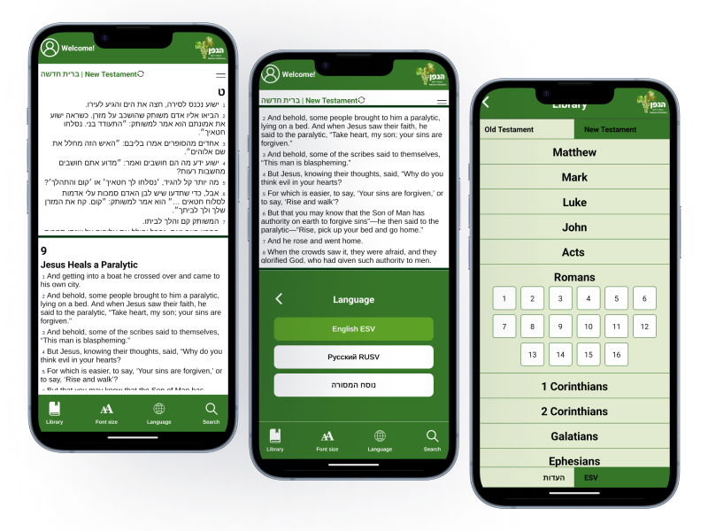
HaEdut - a special mobile application for reading the Bible The HaEdut Bible app, built with Expo React Native, offers a seamless way to read the Scriptures in Modern Hebrew, Masoretic, English, and Russian. Perfect for students and newcomers, it features an intuitive interface and smooth performance for a modern Bible experience.
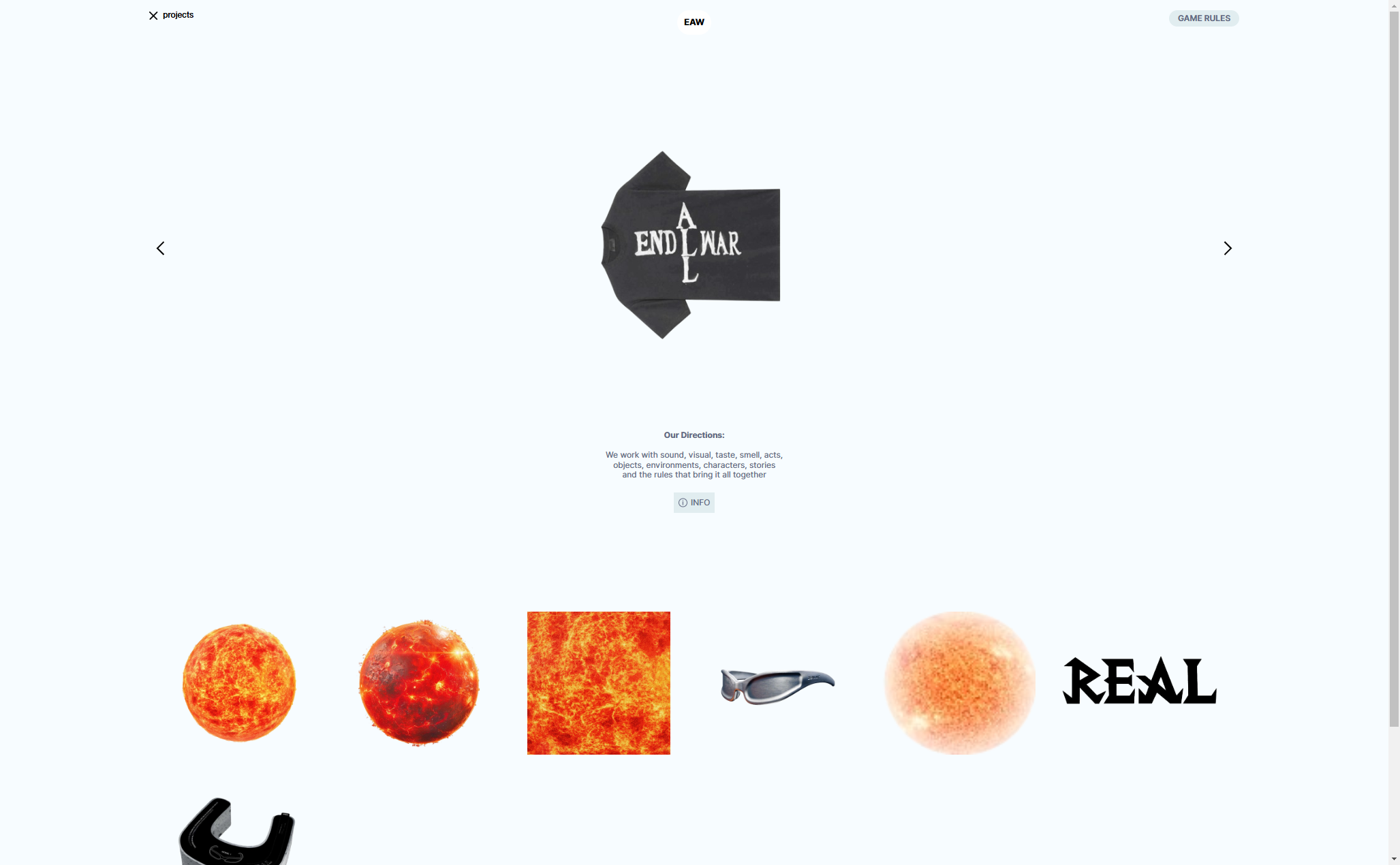
Aliend and Morph - wordpress game website It acts as a digital portal into the client's immersive branding philosophy, inspiring potential clients to think beyond conventional branding strategies.
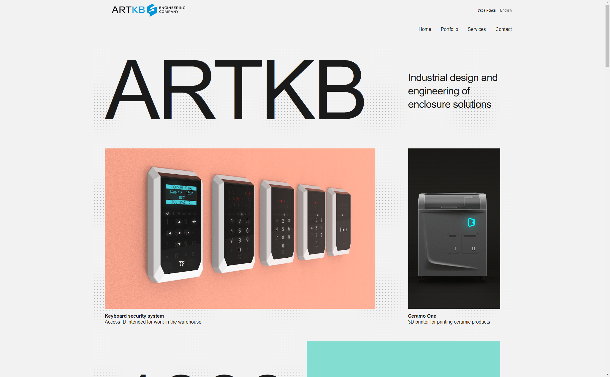
ARTKB - company wordpress website Custom Wordpress Platform for ARTKB to Showcase Their Hardware Engineering Excellence
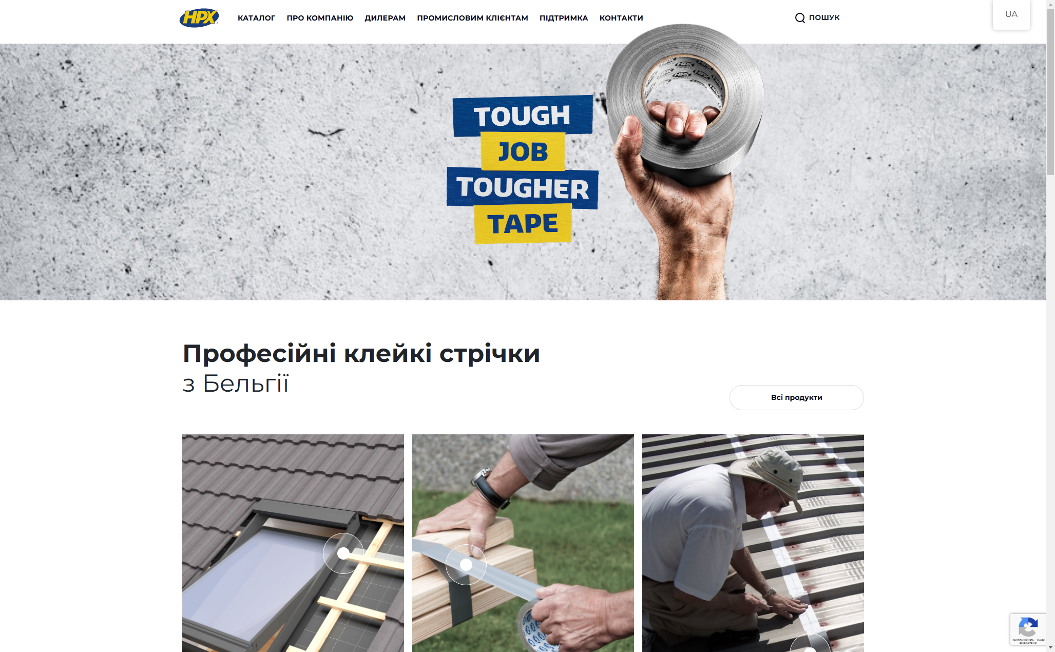
HPX - unique product store | wordpress E-commerce platform for HPX.ua using WordPress and WooCommerce

