Web development
Discover how our web development services can transform your business. From custom web development to ecommerce solutions, we offer a range of services tailored to your needs. Explore the options and select the services that align with your goals.
Mobile apps
Whether you're a startup aiming to disrupt the market or an established enterprise looking to expand your digital footprint, Fykel is your ideal partner for all things app development.
Design
Whether you're a startup establishing your identity or an established company looking to revitalize your brand, Fykel provides customized solutions tailored to your specific needs. Our creative team combines innovation with strategic thinking to deliver designs that not only look great but also drive results.
SEO optimization
Whether you're a small business owner looking to establish an online presence or a large enterprise aiming to outperform competitors, Fykel has the tools and expertise to help you achieve your goals.
Advertising
Whether you're a small business owner aiming to increase local visibility or a large enterprise seeking global reach, Fykel has the tools and knowledge to configure and manage advertising campaigns that deliver results.
IT consulting
Whether you're a startup looking to build a robust IT foundation or an established enterprise aiming to modernize your operations, Fykel has the knowledge and experience to guide you every step of the way.
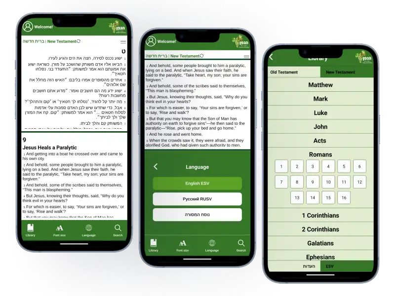
HaEdut - a special mobile application for reading the Bible The HaEdut Bible app, built with Expo React Native, offers a seamless way to read the Scriptures in Modern Hebrew, Masoretic, English, and Russian. Perfect for students and newcomers, it features an intuitive interface and smooth performance for a modern Bible experience.
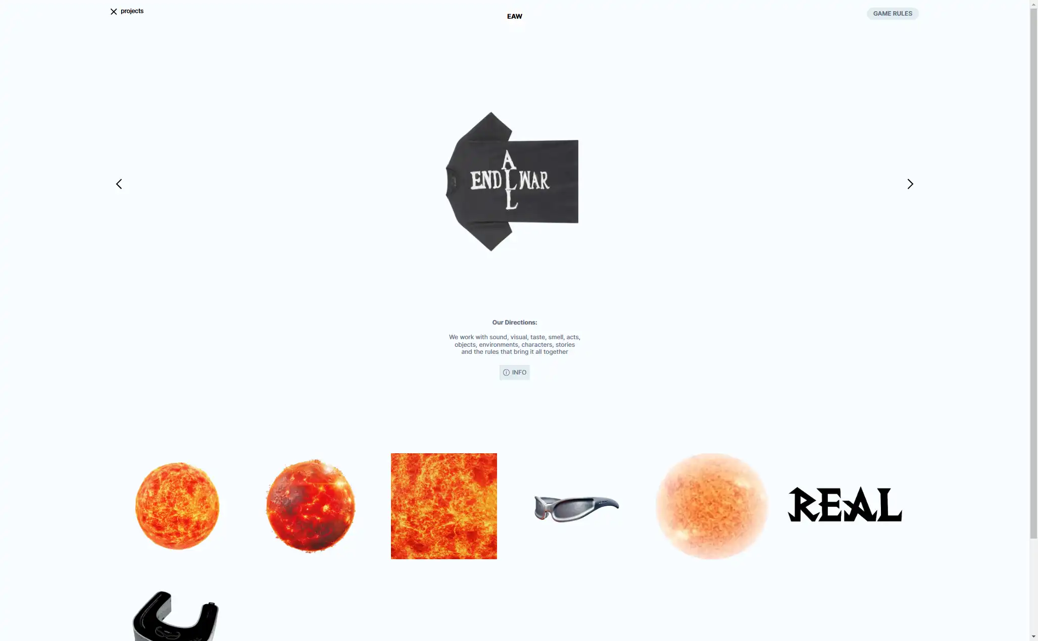
Aliend and Morph - wordpress game website It acts as a digital portal into the client's immersive branding philosophy, inspiring potential clients to think beyond conventional branding strategies.
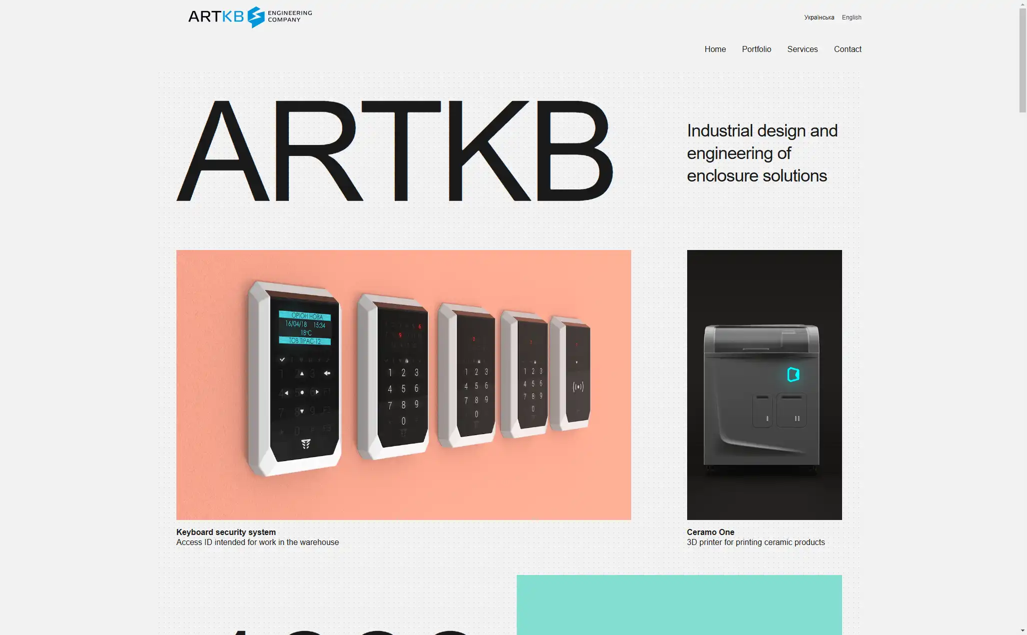
ARTKB - company wordpress website Custom Wordpress Platform for ARTKB to Showcase Their Hardware Engineering Excellence
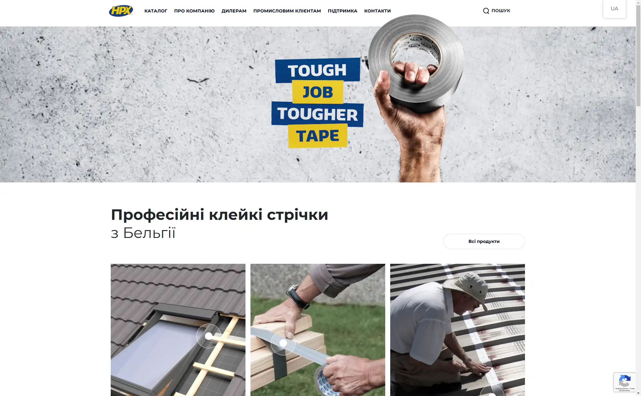
HPX - unique product store | wordpress E-commerce platform for HPX.ua using WordPress and WooCommerce
 How to Choose the Right Platform for Your Mobile App: iOS vs Android
Are you having trouble deciding between Android and iOS for your mobile application? To assist you in making a decision, this guide compares prices, user demographics, and market reach. Examine the benefits and drawbacks of the platform and match your decision to your company's objectives. Revenue-generating solutions for 2025 are provided by Fykel's reasonably priced app development!
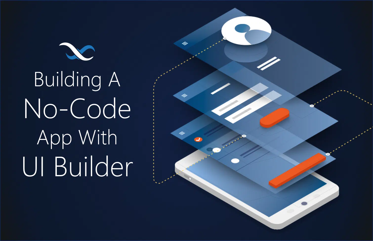 Low-Code Mobile Apps in 2025: Worth It for Your Business?
Are low-code platforms like Bubble and Adalo worth it for your mobile app in 2025? Discover their benefits, limitations, and when to choose professional development with Fykel to build scalable, custom apps that grow with your business. Perfect for startups and small businesses aiming to save time and money.
 How to Speed Up Your WordPress Website
Are slow load times on your WordPress website costing you customers? With useful advice like image optimization, caching, and CDNs, our 2025 guide teaches business owners how to make their websites faster. Better SEO, more leads, and increased revenue are all correlated with a faster website. Create a high-performing website that stimulates growth by using our reasonably priced WordPress optimization strategies. Allow Fykel to assist you in your endeavors!
 Getting Started with React: A Beginner’s Guide
Are you prepared to create a cutting-edge, interactive website for your company? Using straightforward examples, our 2025 beginner's guide to React explains components, state, and props. Discover how to develop high-performing, reasonably priced web applications that generate leads and increase sales. Take your online presence to the next level by beginning your React journey with Fykel's professional advice!