- Enhanced usability leads to increased user retention.
- Simplified interface ensures quick access to important features.
- Boosts mobile traffic by improving accessibility.
- Increases conversion rates and overall sales.
- Improves search engine ranking with responsive design.
Get a free quote
 Exploring Low-Code Development Tools for Rapid Development: Empower Your Business with FYKEL
Discover how FYKEL leverages low-code development tools and industry-leading technologies to create fast, secure, and tailored digital solutions for businesses, empowering startups and enterprises across the USA.
 Unlocking Growth: The Power of AI-Powered SEO Tools for Your Business
Discover how AI-powered SEO tools can transform your business growth. At FYKEL, we offer comprehensive SEO solutions for startups, small businesses, and large enterprises.
 Unlocking Global Potential: The Power of Multi-lingual Apps with AI
Discover the power of multi-lingual apps with AI integration. Partner with FYKEL for exceptional mobile app development that enhances user experience and expands your reach.
 Revolutionizing Healthcare Platforms with Cutting-Edge Web Development - FYKEL
FYKEL creates secure, robust healthcare web platforms using Laravel and React, enhancing patient engagement and operational efficiency for healthcare providers.

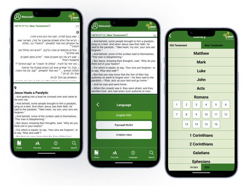
HaEdut - a special mobile application for reading the Bible The HaEdut Bible app, built with Expo React Native, offers a seamless way to read the Scriptures in Modern Hebrew, Masoretic, English, and Russian. Perfect for students and newcomers, it features an intuitive interface and smooth performance for a modern Bible experience.

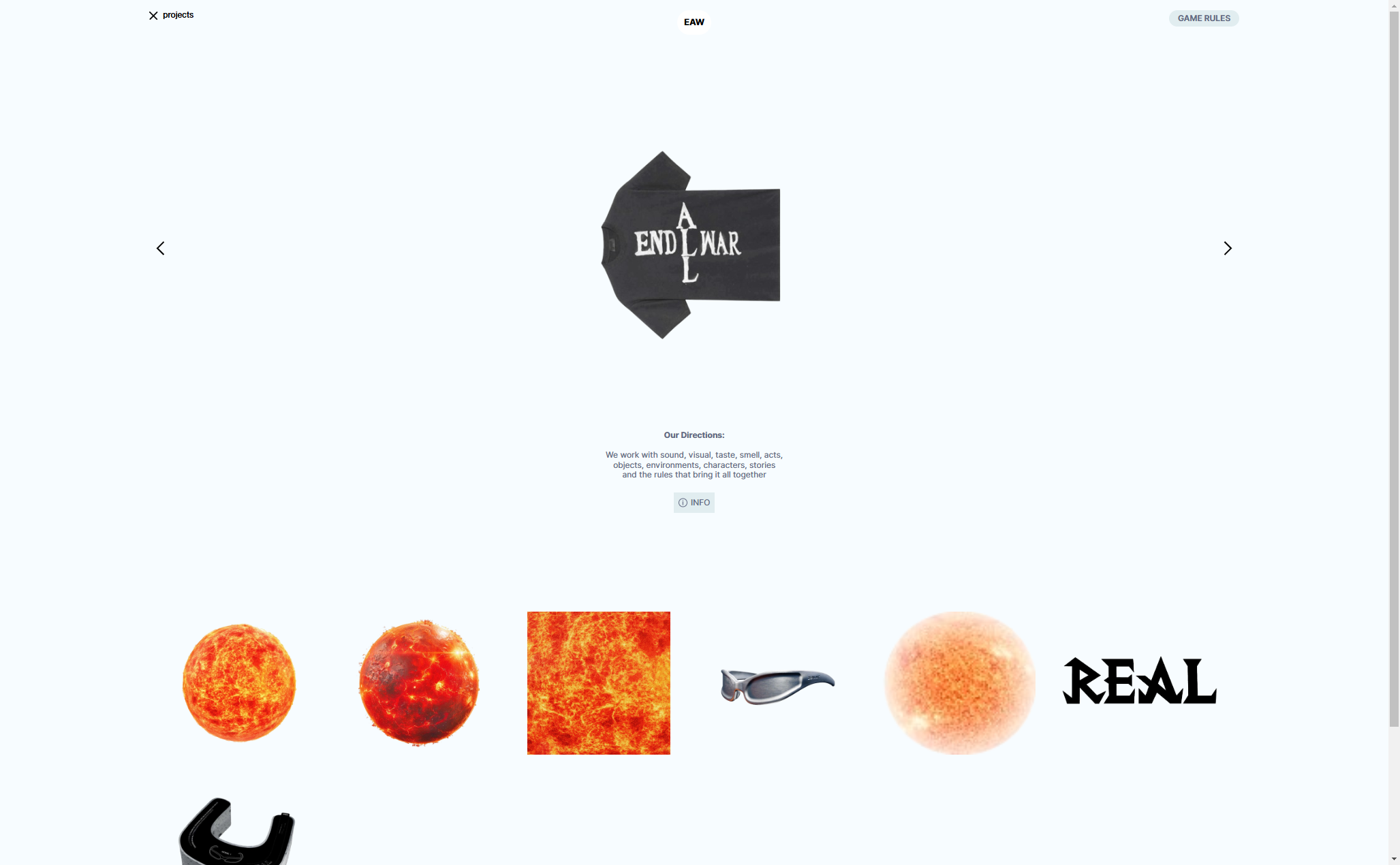
Aliend and Morph - wordpress game website It acts as a digital portal into the client's immersive branding philosophy, inspiring potential clients to think beyond conventional branding strategies.

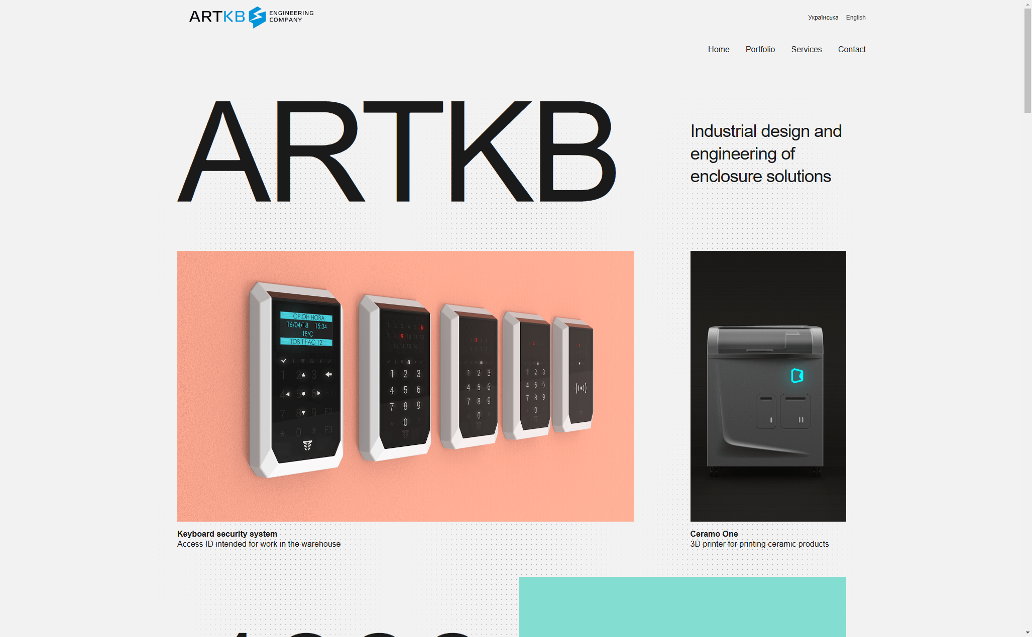
ARTKB - company wordpress website Custom Wordpress Platform for ARTKB to Showcase Their Hardware Engineering Excellence

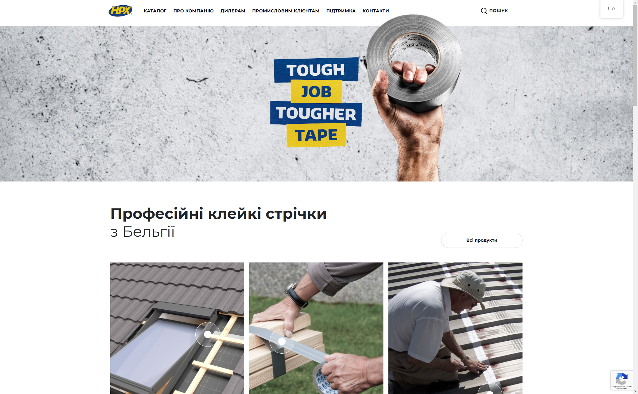
HPX - unique product store | wordpress E-commerce platform for HPX.ua using WordPress and WooCommerce

