- **Enhanced User Engagement**: Navigate easily and keep users from abandoning your site.
- **Improved Conversion Rates**: Streamlined navigation can lead to higher conversion rates.
- **Decreased Bounce Rates**: Users are more likely to stay on a well-designed mobile site.
- **Accessibility for All Users**: Ensures all users, regardless of their dexterity, can navigate smoothly.
- **Increased Customer Satisfaction**: A seamless experience leads to happier, repeat customers.
Get a free quote
 Developing Energy-Efficient Websites: The Future of Sustainable Digital Growth with FYKEL
Discover how FYKEL's energy-efficient web development can boost your online presence while reducing costs. Contact us to start a sustainable digital transformation.
 How to Integrate Payment Gateways for a Smooth Checkout
Understanding Payment Gateways
In today's digital age, a seamless checkout experience is crucial for retaining customers and driving sales. Paymen
 Why Scannable Content Is Essential for Usability
Understanding Scannable Content
In today’s fast-paced digital world, users often skim through content rather than reading it in-depth. Scannable c
 Building Brand Trust with Transparent Web Design
Why Transparency in Web Design Matters
In today's digital landscape, where consumers are inundated with choices, establishing trust is paramount fo
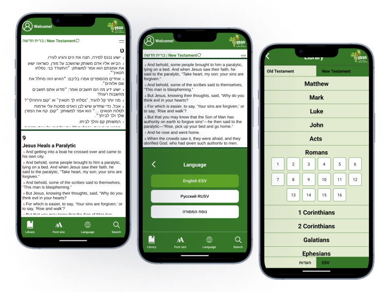
HaEdut - a special mobile application for reading the Bible The HaEdut Bible app, built with Expo React Native, offers a seamless way to read the Scriptures in Modern Hebrew, Masoretic, English, and Russian. Perfect for students and newcomers, it features an intuitive interface and smooth performance for a modern Bible experience.
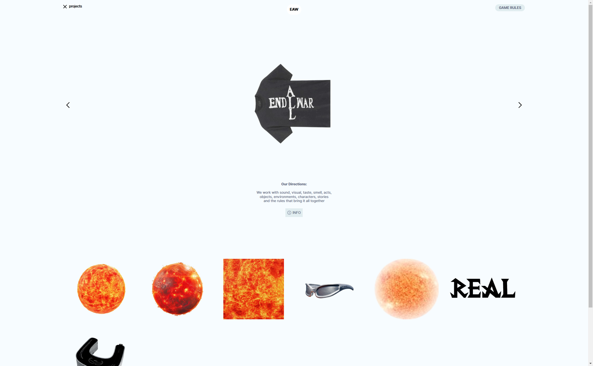
Aliend and Morph - wordpress game website It acts as a digital portal into the client's immersive branding philosophy, inspiring potential clients to think beyond conventional branding strategies.
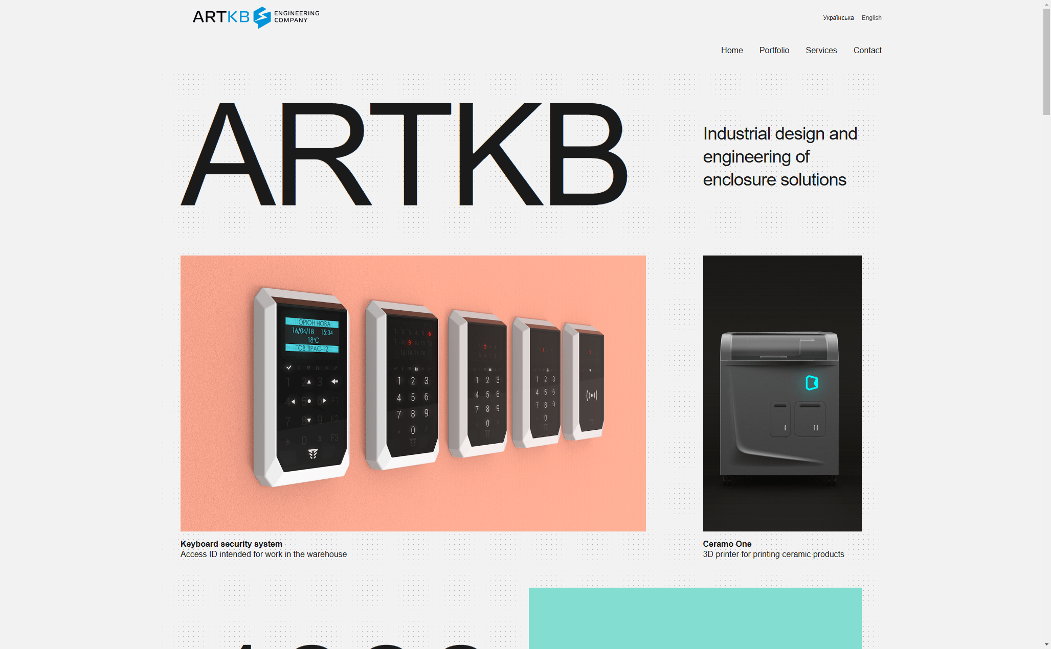
ARTKB - company wordpress website Custom Wordpress Platform for ARTKB to Showcase Their Hardware Engineering Excellence
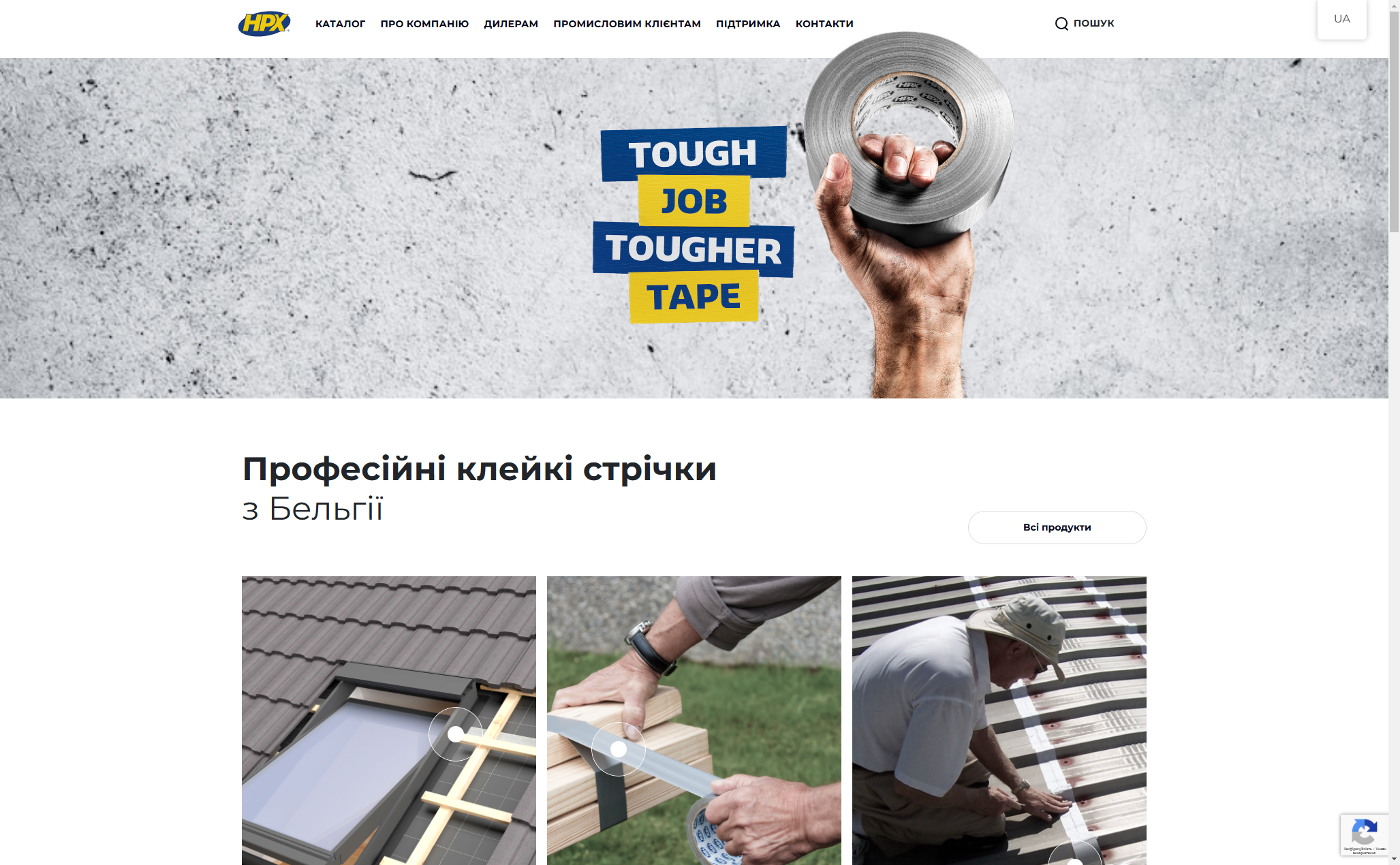
HPX - unique product store | wordpress E-commerce platform for HPX.ua using WordPress and WooCommerce

